Aurelia Identity
An internal concept study for an identity system that shows logo, type, UI, print and web as one proof sheet.
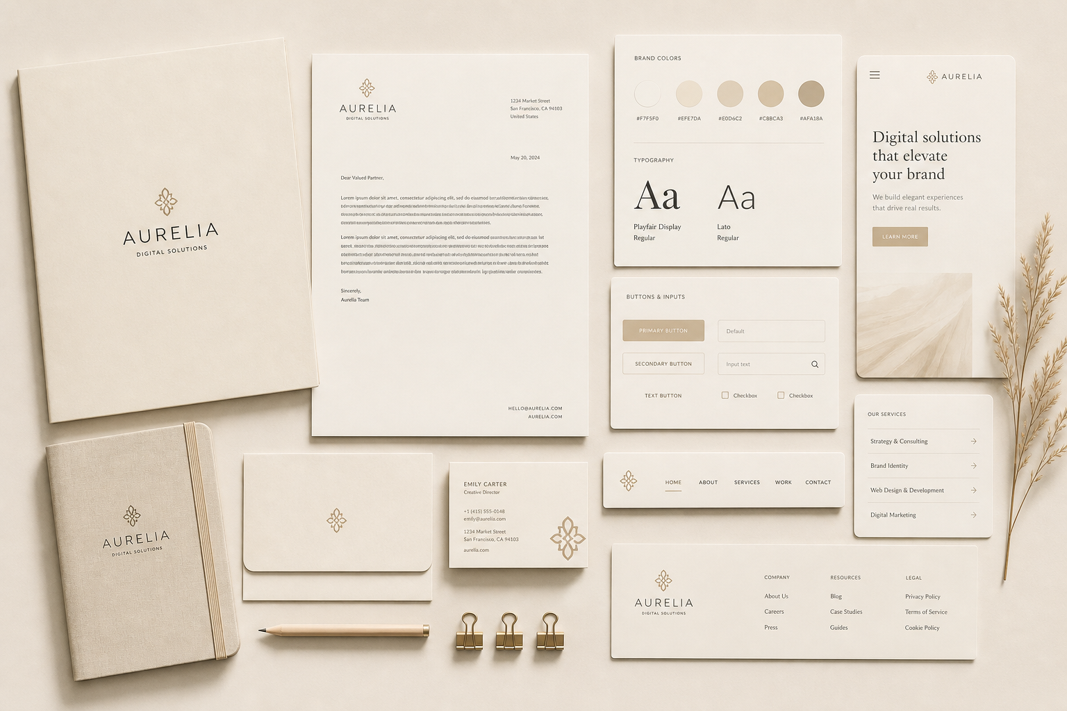
00 — About the client
A brand-system concept that treats the website as part of a larger operating kit: stationery, buttons, type, palette, navigation and service cards all shown together.
01 — The brief
What they needed
Show prospects what a designed business system looks like beyond a homepage screenshot.
The constraint that shaped it
The palette had to stay quiet and tactile, with enough structure to avoid becoming beige lifestyle branding.
02 — Typography
Display — Fraunces
Aa Gg
The quick brown fox.
Body — Geist
The quick brown fox jumps over the lazy dog. 0123456789 — legibility holds from caption to paragraph.
Why this pairing
A refined serif carries the identity voice; a clean sans keeps UI elements and service lists functional.
03 — Color
Ivory
#f7f5f0
Warm paper
#efe7da
Brass
#b79b6f
Ink
#221d17
04 — Wireframe → Mockup → Prototype
Inventory
Every brand touchpoint is treated as part of the same system.
Mockup
The proof sheet shows type, palette, UI and collateral in one composed view.
Prototype
A concept direction for service businesses that need brand trust before the first call.
05 — What this explores
A concept study, not a client result: the point is to show the strategic move, the interface direction, and the kind of conversion path we would build if this were commissioned.