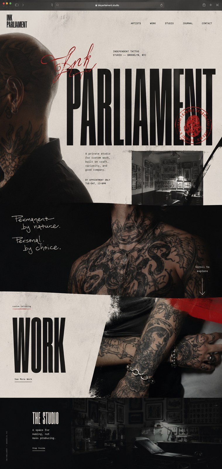
Parliament
A concept redesign that treats an independent tattoo studio's portfolio as the whole site — editorial, not a template.
00 — About the client
A concept for the kind of independent studio stuck on a locked-in template builder — strong artists, serious work, hidden behind a generic site they can't even edit. The redesign makes the ink the entire experience.
01 — The brief
What they needed
Put the tattoo work at gallery scale and make booking obvious, without it reading like every other shop site.
The constraint that shaped it
The studio's identity is the work and the people — the design has to carry that weight in print, not decorate around it.
02 — Typography
Display — Bodoni Moda
Aa Gg
The quick brown fox.
Body — Geist
The quick brown fox jumps over the lazy dog. 0123456789 — legibility holds from caption to paragraph.
Why this pairing
A tall, high-contrast Didone sets the studio name like a fashion masthead; a quiet neutral grotesk keeps the booking and studio copy legible underneath. A single oxblood handwritten script adds the human mark.
03 — Color
Ink black
#0c0d0d
Bone
#dcd4cb
Oxblood
#7d0e0f
Sepia
#3a2f29
04 — The work
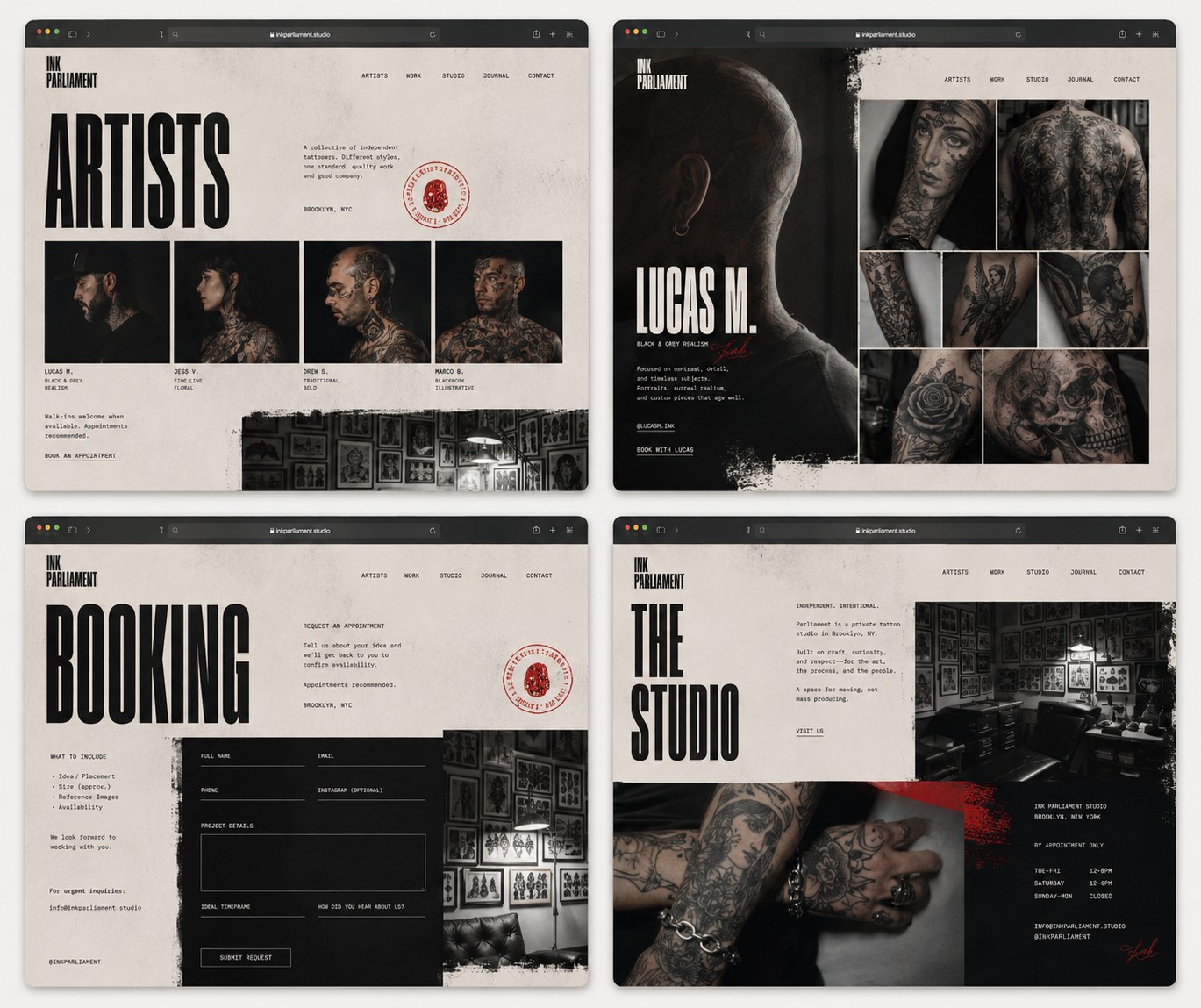
05 — What this explores
A concept study, not a client result: the point is to show the strategic move, the interface direction, and the kind of conversion path we would build if this were commissioned.