Brickstone Dashboard
An internal concept study for a high-trust dashboard that makes financial complexity feel controlled.
00 — About the client
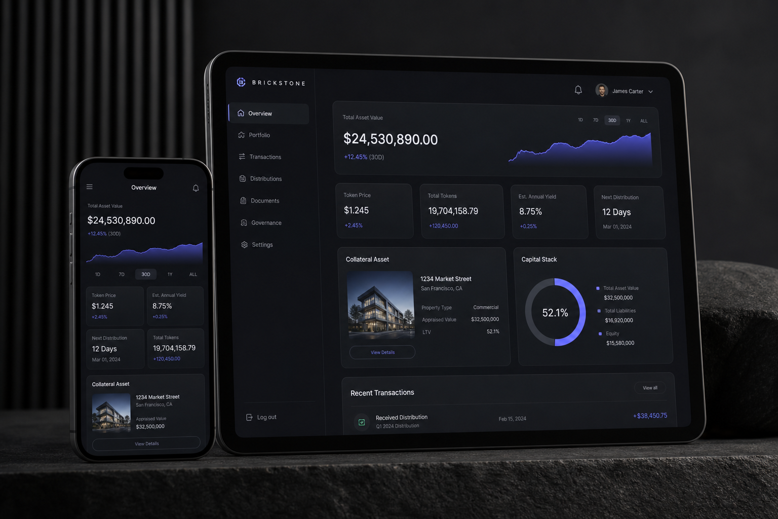
A studio exercise in enterprise interface polish: dark-mode reporting, high-value metrics, asset cards and transaction tables presented without the usual SaaS clutter.
01 — The brief
What they needed
Show that Zaffre can design operational software, not only brochure sites.
The constraint that shaped it
The interface had to feel expensive and calm while still carrying real dashboard density.
02 — Typography
Display — Geist
Aa Gg
The quick brown fox.
Body — Geist
The quick brown fox jumps over the lazy dog. 0123456789 — legibility holds from caption to paragraph.
Why this pairing
A neutral grotesk keeps the product surface precise; weight and spacing create hierarchy instead of decoration.
03 — Color
Night
#080a10
Panel
#151923
Signal blue
#6872ff
Glow text
#d9ddff
04 — Wireframe → Mockup → Prototype
System
Information architecture first: value, trend, asset, capital stack, transactions.
Mockup
Dark glass panels and restrained blue marks give the data weight without noise.
Prototype
A concept direction for founders who need investor-grade software surfaces.
05 — What this explores
A concept study, not a client result: the point is to show the strategic move, the interface direction, and the kind of conversion path we would build if this were commissioned.