Nexora Fintech
An internal concept study for a banking product that turns digital balance into a tactile object.
00 — About the client
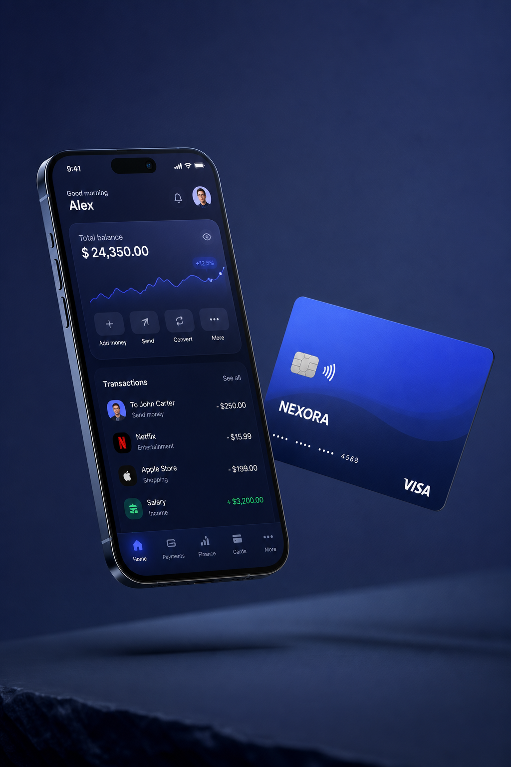
A mobile banking concept built around material credibility: a dark mobile interface, a physical card, and a visual system that feels secure without becoming corporate.
01 — The brief
What they needed
Make a fintech product feel trustworthy before the user reads any feature copy.
The constraint that shaped it
Finance interfaces need clarity first. The atmosphere can be cinematic, but the numbers still have to read immediately.
02 — Typography
Display — Geist
Aa Gg
The quick brown fox.
Body — Geist
The quick brown fox jumps over the lazy dog. 0123456789 — legibility holds from caption to paragraph.
Why this pairing
A single precise sans keeps the mobile surface practical; contrast comes from scale, not font novelty.
03 — Color
Midnight
#071024
Card blue
#122a64
Zaffre signal
#2f6bff
Interface white
#f4f8ff
04 — Wireframe → Mockup → Prototype
Flow
Balance, transactions and core payment actions are kept within thumb reach.
Mockup
Device and card become one proof object, not a floating app screenshot.
Prototype
A concept direction for fintech founders who need credibility on day one.
05 — What this explores
A concept study, not a client result: the point is to show the strategic move, the interface direction, and the kind of conversion path we would build if this were commissioned.