Ironwood Construction Co.
A concept redesign for a portfolio that wins the bid before the first call.
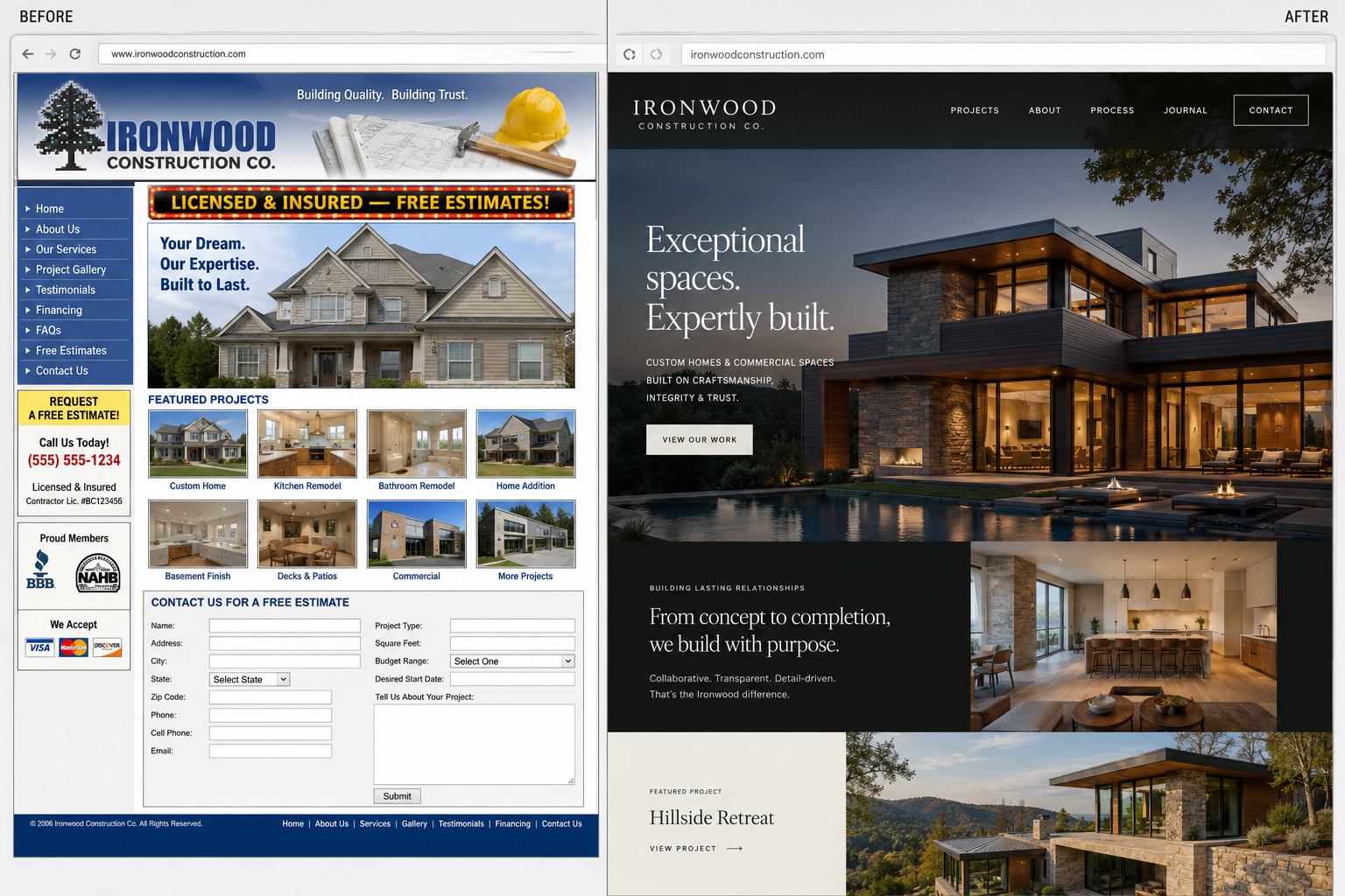
00 — About the client
A general contractor doing beautiful custom homes and commercial builds, with a website that showed none of it — a dated template, clip-art tools, and a contact form that asked for everything and showed nothing.
01 — The brief
What they needed
Make the finished work the entire pitch — big, real project photography — and capture serious leads without a twelve-field form.
The constraint that shaped it
A homeowner or developer judges a builder by the last thing they built. The work had to carry the page.
02 — Typography
Display — Clash Display
Aa Gg
The quick brown fox.
Body — Satoshi
The quick brown fox jumps over the lazy dog. 0123456789 — legibility holds from caption to paragraph.
Why this pairing
Clash Display gives the headlines structural weight; Satoshi keeps project specs and the lead form quiet and legible.
03 — Color
Iron
#1c2024
Steel blue
#3d5a73
Oak
#a87f53
Concrete
#eef0f0
04 — Wireframe → Mockup → Prototype
Wireframe
Project gallery pulled to the top — the build is the hero, not the pitch.
Mockup
Full-bleed project photography; steel marks only the 'Start a project' action.
Prototype
A filterable project archive, a short qualified-lead form, a sticky estimate CTA.
05 — What this explores
A concept study, not a client result: the point is to show the strategic move, the interface direction, and the kind of conversion path we would build if this were commissioned.